
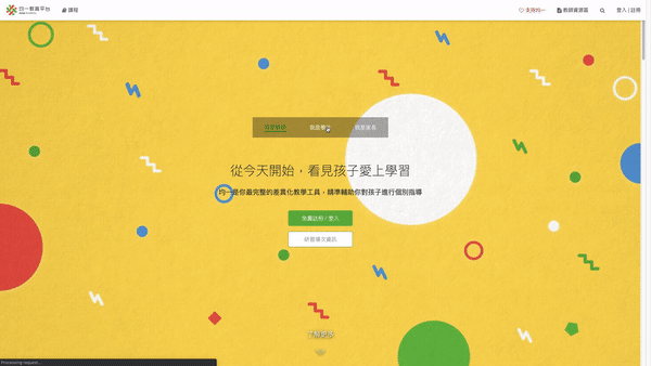
JUNYI ACADEMY
CLOUD-BASED LEARNING MANAGEMENT SYSTEM
Junyi Academy is a Taiwan based non-profit eduTech organization with the goal of creating a set of online tools that help educate students. The organization produces short lessons in the form of videos. Its website also includes supplementary practice exercises and materials for educators. Also, LMS to track learning performance.
This “Report Upgrade” project demonstrates very well of my capability to wear different hats through the whole product cycle. From user research, iterating designs solutions, to full-stack programming and testing.
Landing page onboard
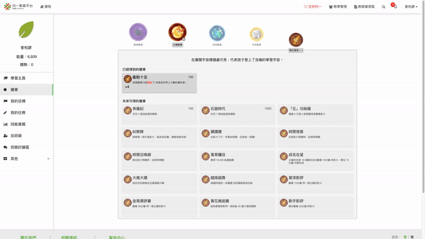
Gamification and self learning scheduling
Assign supplementary exercises and lecture videos
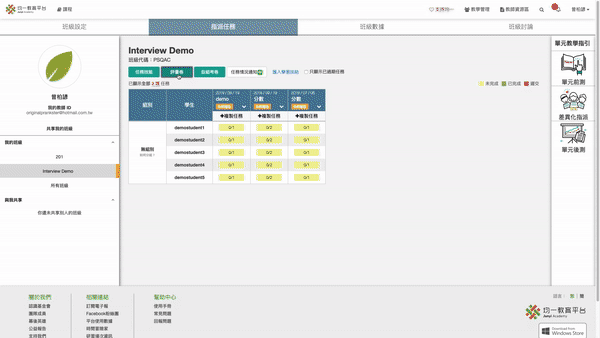
Dashboard reports
PRIMARY USERS
K-12 EDUCATORS AND STUDENTS
Jane is a third grade teacher who has to handle 34 students that varies in learning performance and age. Usually she do not have time to provide personalized help because understanding each student is extremely time consuming. There were 20,000+ teachers and 600,000 students and currently more than a million users in total.
FACILITATE EFFECTIVE LEARNING FEEDBACK LOOP
Jane uses Junyi in her daily teaching to better understand each student. For instance, she assigns lecture videos and exercises to her students when she teaches the concept of multiplication. She could navigate to the dashboard report page to track learning progress and give personalized assistance to each student according to tracked data.
MAIN PROBLEM
TEACHERS DO NOT PROVIDE FURTHER HELP TO STUDENTS AFTER READING THE DASHBOARD REPORT.
Students in rural area where schools are understaffed or students from lower socioeconomic status families are usually those who need help in education. A common phenomena in Taiwan is - these students do no receive enough assistance over the course of formal education, losing competitiveness and social mobility, which make this demographic segment highly correlated with social issues.
Junyi aims to utilize technology to help strengthen the educator-student feedback loop so all students could thrive at school and gain social mobility.

GOAL
FIX THE BROKEN LOOP
Improve the existing dashboard report with the goal of motivating educators to provide assistance to students who need help. Increase the success metric to at least 10%.
SUCCESS METRIC

MY ROLE
END-TO-END UX DESIGNER
I deliberately requested to run end-to-end design for this project alone. I am responsible for the user research, ideation, information architecture, sketching, wireframing, prototyping, usability testing, full-stack programming, and ab-testing
CROSS-FUNCTIONAL TEAM COLLABORATION
1 Project manager
3 Software engineers
2 Data scientists
Content team
Marketing team
USER RESEARCH
SPEAK WITH DATA
Quantitative research
Discover behavior pattern and verify ubiquitousness of reported facts by writing GQL and Python code.
Qualitative research
Conduct interviews with educators and observe how teacher-student interactions in classrooms to collect qualitative data.
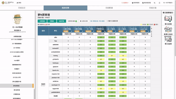
OLD REPORT VIEW
Interface is translated to English and redesigned to address the cultural difference in writing. In traditional Chinese, right-to-left and horizontal writing is extremely common, which makes the design layout and visual hierarchy significantly different from English interface.
Teachers log in to view the dashboard report from the backend, it is not visible for student. Each main row is a student and each main column is a lecture video or a single exercise question.

“The report gave me statistics not actionable insights”
UX DESIGN
ITERATING WITH USERS
DATA-DRIVEN
We verified whether a feedback is a general issue across the platform by Python code.
PARTICIPATORY DESIGN
Invite teachers to join design iterations offline and sent out feature-wishlist to collect feedbacks.
HEURISTIC EVALUATION
Examine UI with teaching experts and target users to meet usability goals.
INTERACTIVE PROTOTYPE
Test interactions with Sketch and by writing front-end code in Javascript, HTML, and CSS.
DESIGN SOLUTIONS
COLOR CODING
In a simple glance, teacher could locate students who need help. Eye soothing colors were chosen for easier reading and improve accessibility. Label was grouped and updated with clearer explanations to allow first-time user adopt faster. Notably, table width is significantly reduced for conveying the same amount of information.
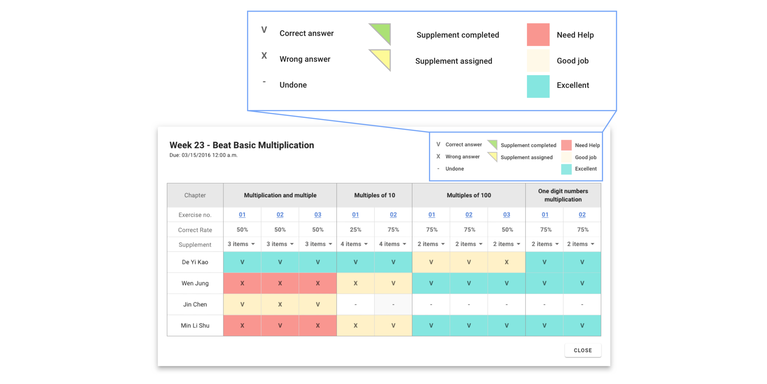
RECOMMENDATION DROP-DOWN
A drop-down list of suggested lecture videos and exercises related to the chapter is added. With simple clicks, teachers could give effective and personalized materials to students in need. This improvement encourage actions by alleviating the cognitive effort of coming up with meaningful help. Teachers could give out the recommended materials or get inspirations from the materials.

ANSWER HISTORY
The more thorough a student’s thinking process is perceived, the higher level of personalized assistance teachers could give. Therefore, I added a new feature - the answer history. Detail history such as time spent on the exercise, how the hints were used, and all past answers are ready to view upon a single click on the report.

NEW REPORT VIEW
After testing out several alternative solutions with our users and examined with education experts on usefulness, and discussed feasibility with engineers, I finalized our improvement items to address the problem of not having actionable insight of the old dashboard. With this new dashboard report, teachers are able to find students in need with just a glance, give personalize help efficiently, and grasp detail thinking process with a single click.


Color coding to show which student need help
recommendations to encourage teachers action
Provide answer history to unveil thinking process
COLOR CODING
RECOMMENDATION DROP-DOWN
ANSWER HISTORY
RESULT
SIGNIFICANT SUCCESS METRIC LEAP
The system was a/b tested for four weeks in total to collect quant data for verification and ensure no serious bug effecting user experience. Users behaviors were recorded and analyzed with BigQuery and Google Analytic, which we found an increasing trend of teachers assigning customized learning materials to students, alongside with a rise on time spent on the report. We successfully surpass the goal set at the beginning and increased the success metric to 19.7%, which is almost five times of the original percentage. Finally, the new report system was deployed to live server serving more than 600K users at that time.


QUALITY FEEDBACK

“The recommended exercises are on point, feels like it is designed by experienced teachers. I trust the content and would add on other supplementary material depends on individual needs. The new report save me so much time!”

“After the update, I read the report all the time. I could locate which students in my class need help right away. The colors and labels are clear and comfortable to read.”

“Thanks to the answer history, because you know, when a student don’t understand a problem, it is difficult to express what kind of help they need. Now I could view the history to start the conversation more effectively.”
TAKEAWAY
COMMUNICATION! COMMUNICATION! COMMUNICATION!
If I could go back in time and give myself an advice. I’d told myself and the team, remember to communicate clearly with users about the change. The report is a major feature on the website, although we deployed the new dashboard gradually from 10% of users to all users. We did not explain what and why did we make this change beforehand, and therefore, some of our users reached out to us for clarification. We should have had emails sent and site-alert to inform and to build trust with our users.

Before you go…
check out some visuals and UI?