

[Junyi academy] end-to-end design
Role
UX Researcher
UX Designer
Full-stack coding
Tool
Sketch
Google BigQuery
Method
Contextual Inquiry
AB testing
Data-driven design
Date
Feb 2016 -
July 2017
This project demonstrates very well of my ability to wear different hats confidently along the whole product journey. From user research, iterating through designs, prototyping, to full-stack programming. Currently, I worked a lot more on interaction design in emerging tech fields such as Augmented reality, self-driving cars, and had improved a lot in visual execution, but I still love how challenging this project is and would love to share it with you.
Junyi Academy is a highly reputed NPO edTech company based in Taiwan, and its mission is to provide an equal opportunity for students under any circumstance to learn and thrive in formal education system. The main service is an online learning platform providing tools and video contents and supplementary exercises to educate students. The functionality and use cases are very similar to Khan Academy. Now serving more than a million K-12 educators and students in the Chinese speaking world.
Challenge
How do we use technology to enhance personalize education Experience for all?
Data-Driven end-to-end design
Unwrap
Discover teacher users’ activities by data analysis
Conduct interviews with teachers
Verify ubiquitousness of reported facts with data
Study how teachers interact with students in classrooms
Process
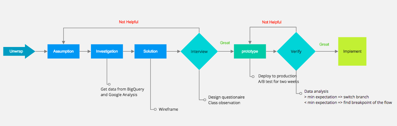
Unwrap
Teachers have hard time understand learning progress of each student in limit amount of time, which result in students leaving behind and loosing confidence in their studies bit by bit. Finally, these kids give up on formal education. In places lacking education resources, this phenomenon is even more significant. Therefore, we built a smart dashboard that analyze the weak spots of each student's learning and suggest essential prerequisites accordingly. Thus, teachers and learners could focus on right things to pick up.
To understand each student's progress, what indicators does a teacher need?
Why do they need these indicators?
How to show these indicators on a report?
Would these indicators vary in particular environments such as small remote schools?
Existing feature
A teacher can get this info from the report:
Correction rate for each question.
Time spent on each question for each student
Questions that were skipped by student
Assumptions
We made a few assumptions:
Teachers don't need the exact time spent on each question but need to know whether student need help. There are situations that students skip the problem immediately once they notice it is too difficult for them to answer; thus, less time spent does not equal to great understanding. On the other hand, students might pause to think, which the time spent on that particular problem would be longer than average. Therefore, the correlation between time spent and level of comprehension is too weak.
A teacher would like to know the process of a student answering a question, the number of hints used, and how many times student try before getting the right answer.
We could save teacher a lot of time by automatically recommend related exercise to a student who needs help on specific concepts.
It would be more efficient for teacher to recognize students' needs if we categorize questions into knowledge trunks from each chapter
Investigation
From Google Analysis and BigQeury through our Google Cloud Storage, we found teachers didn't stay at the old report page for less than two minutes and did not have significant online actions after reading the reports(such as assigning related videos or exercise to students). It indicates the report wasn't good enough to stimulate reactions from teachers to give out individual help. Also, urban and rural teachers have similar behaviors on the usage of the report.
Adding on the previous point, we conducted contextual inquiries in three different classes, interviewed more than five teachers which we found that no matter in urban or rural areas, what teachers care the most is if the student need help on his/her learning
Design Sketch
Based on data collected from the research, we decide to refine our report, building these following features:
Categorize questions into chapters.
Calculate correct rate for the answers to each chapter/per student.
Color code correct rate to indicate whether a student need help in a particular chapter
Create links to answer history for each problem.
Recommend related exercise and exams to teachers, which decrease the cognitive load of searching and assigning materials, stimulate a more customized teaching and learning relationship.
Corner tags to show the status of completion of recommended missions.
Prototype & Implementation
We interviewed four internal teaching experts and five external teachers to assure that our design meets the need of teachers, which we received positive feedbacks along with some suggestions in color coding and phrase usage in the report. Next, I spent about three sprints (we do scrum and a sprint last two weeks) to implement the system below.
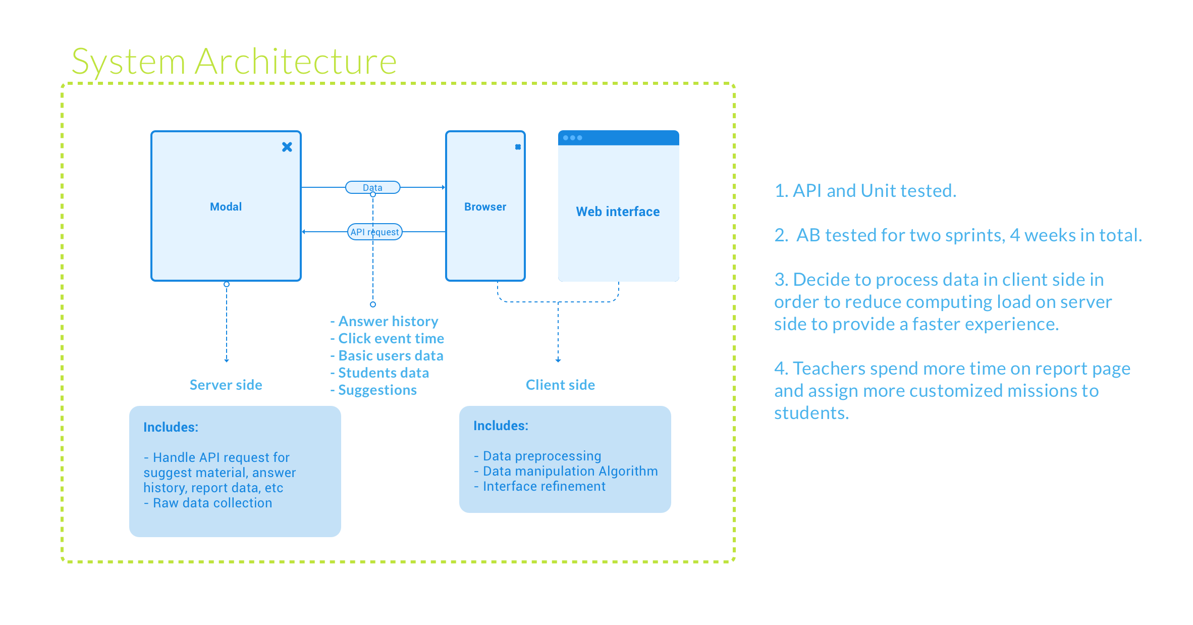
The Indicators -
Clear Indication of students' progress is shown in the top right of the report. Students who need help are highlighted with colors. The wordings we use are well-thought. Instead of "fail", "fair", "great". We use "one more try," "with potential," "nice nice nice," in the report to convey the spirit of encouragement.
The recommendations -
Suggested Exercise and Videos for each question are shown in the drop-down, which are for a teacher to view and assign them.
The history -
By clicking on the "O" or "X" on the report, teachers would be directed to the answer history of that slot. The history we saved in the database is very detailed, even with time spent on each step.
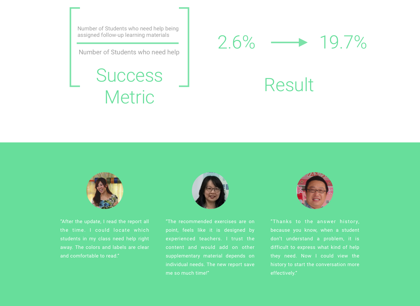
The system was a/b tested for another two sprints, which is four weeks in total to make sure no serious bug was reported. Users behaviors were recorded and analyzed on BigQuery platform and Google Analytic platform, which we found an increasing trend of teachers assigning customized learning materials to students, alongside with a rise on time spent on the report. Finally, the new report system was deployed to live server serving more than 600K users at that time.